Lean
Ingenious
Skillful
Edit on StackBlitz
"use client";
import { useEffect, useRef } from "react";
import { ViewWatcher } from "lisn.js";
import Image from "next/image";
import styles from "./demo.module.css";
export default function Page() {
const demoRef = useRef(null);
const sectionRefs = useRef(new Set<Element>());
const addSectionRef = (section: Element | null) => {
if (section) {
sectionRefs.current.add(section);
}
};
useEffect(() => {
let watcher: ViewWatcher;
const main = demoRef.current;
const sections = [...sectionRefs.current];
if (main) {
watcher = ViewWatcher.create({
root: main,
rootMargin: "200px",
});
for (const section of sections) {
watcher.trackView(section, null, {
debounceWindow: 0,
resizeThreshold: 0,
scrollThreshold: 0,
});
}
}
return () => {
// cleanup
for (const section of sections) {
watcher.noTrackView(section);
}
};
}, []);
return (
<>
<div className={styles.wrapper}>
<div ref={demoRef} className={[styles.demo, "light-theme"].join(" ")}>
<div ref={addSectionRef} className={styles.section}>
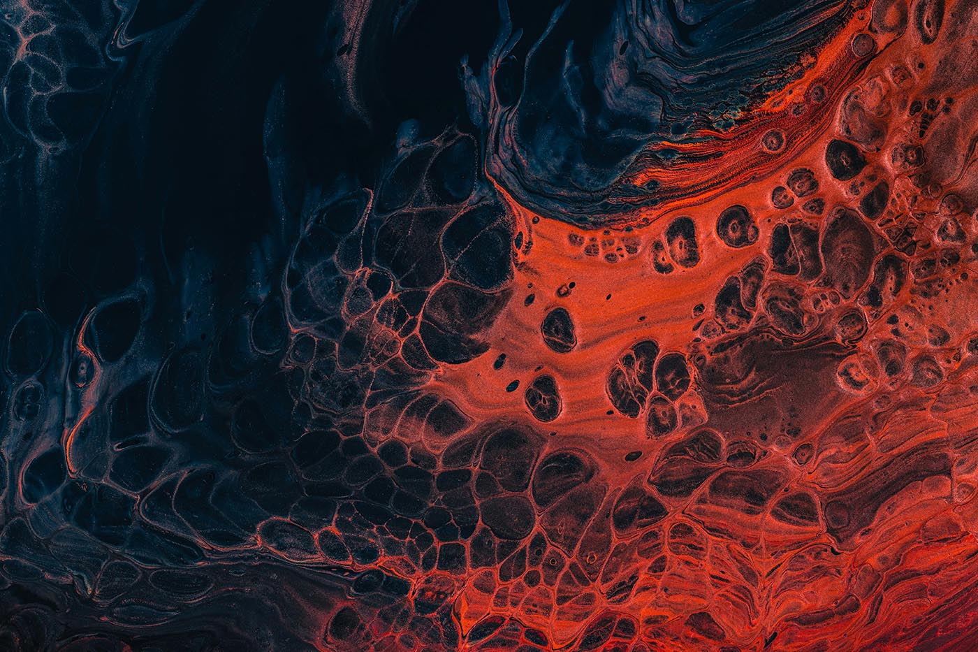
{/* https://unsplash.com/photos/a-close-up-of-a-red-and-black-substance-OOFSqPWjCt0 */}
<div className={styles.background}>
<Image src="/images/abstract-1.jpg" alt="" />
</div>
<div className={styles.content}>
<div className={styles.card}>
<h1>Lean</h1>
</div>
</div>
</div>
<div ref={addSectionRef} className={styles.section}>
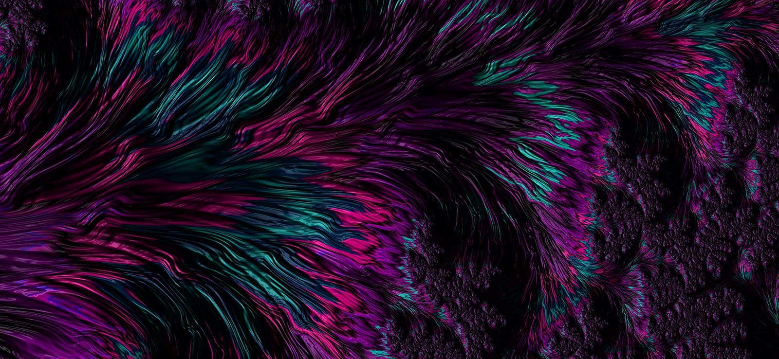
{/* https://unsplash.com/photos/a-purple-and-green-abstract-background-with-lots-of-lines-pEgsWN0kwbQ */}
<div className={styles.background}>
<Image src="/images/abstract-4.jpg" alt="" />
</div>
<div className={styles.content}>
<div className={styles.card}>
<h1>Ingenious</h1>
</div>
</div>
</div>
<div ref={addSectionRef} className={styles.section}>
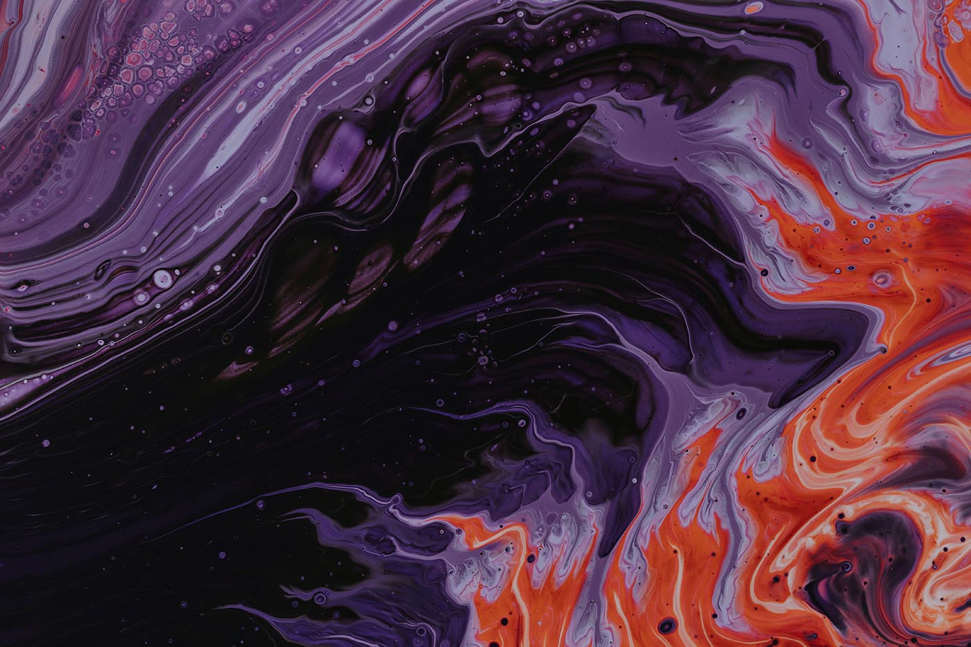
{/* https://unsplash.com/photos/purple-black-and-orange-abstract-paintin-arwTpnIUHdM */}
<div className={styles.background}>
<Image src="/images/abstract-3.jpg" alt="" />
</div>
<div className={styles.content}>
<div className={styles.card}>
<h1>Skillful</h1>
</div>
</div>
</div>
<div ref={addSectionRef} className={styles.section}>
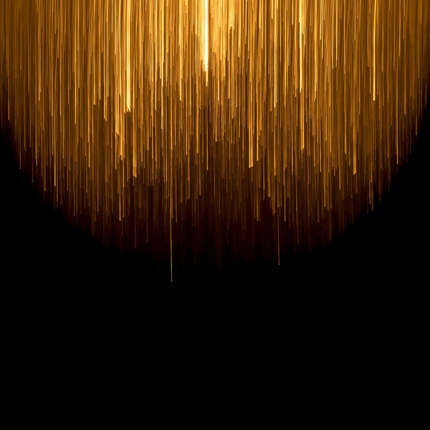
{/* https://unsplash.com/photos/a-very-long-line-of-yellow-lines-on-a-black-background-YeUVDKZWSZ4 */}
<div className={styles.background}>
<Image src="/images/abstract-2.jpg" alt="" />
</div>
<div className={styles.content}>
<div className={styles.card}>
<h1>Natty</h1>
</div>
</div>
</div>
</div>
</div>
</>
);
}
/* Container and sections */
.wrapper {
  position: fixed;
  top: 0;
  left: 0;
  width: 100vw;
  width: 100dvw;
  height: 100vh;
  height: 100dvh;
  display: flex;
  flex-direction: column;
  align-items: center;
  justify-content: center;
  overflow: hidden;
}

.demo {
  width: 100%;
  height: 100%;
  overflow: auto;
}

.section {
  width: 100%;
  height: 80%;
  position: relative;
}

.section:first-of-type {
  margin-top: 40vh;
}

.section:last-of-type {
  max-height: 60%;
}

/* Section background */
.section .background {
  width: 100%;
  height: 100%;
  overflow: hidden;
  position: absolute;
  top: 0;
  left: 0;
}

.section .background img {
  --max-offset: 0.4;
  --rel-top: var(--lisn-js--r-top, 0);
  pointer-events: none;
  position: absolute;
  z-index: -1;
  top: 0;
  left: 0;
  width: 100%;
  height: calc(100% * (1 + var(--max-offset)));
  object-fit: cover;
  overflow-clip-margin: unset;
  transform: translate3d(
    0,
    calc(-100% * var(--max-offset) * var(--rel-top)),
    0
  );
  will-change: transform;
}

/* Section content */
.content {
  width: 100%;
  height: 20px;
  background-image: linear-gradient(
    0deg,
    transparent -150%,
    var(--bg-color-lightest) 40%,
    var(--bg-color-lightest) 60%,
    transparent 250%
  );
  transform: translateY(-50%);
}

.card {
  --max-scale-down: 0.3;
  position: absolute;
  width: 80vw;
  max-width: 400px;
  top: 0;
  left: 50%;
  padding: 3vh 3vw;
  border-radius: 20px;
  background-image: linear-gradient(
    0deg,
    transparent -100%,
    var(--bg-color-lightest) 30%,
    var(--bg-color-lightest) 70%,
    transparent 200%
  );
  color: var(--text-color);
  text-align: center;
  /* Because the section is full-screen height, --lisn-js--r-v-middle will
           range between approximately 1.5 and approximately 0.5 */
  transform: translate(-50%, -50%)
    scale(
      calc(
        1 - var(--max-scale-down) * 2 *
          max(
            var(--lisn-js--r-v-middle, 0) - 1,
            1 - var(--lisn-js--r-v-middle, 0)
          )
      )
    );
  will-change: transform;
  transition-property: transform;
  transition-duration: 0.1s;
}
Edit on CodePen
document.addEventListener("DOMContentLoaded", () => {
  const main = document.getElementById("demo");
  const watcher = LISN.watchers.ViewWatcher.reuse({
    root: main,
    rootMargin: "200px",
  });

  for (const section of main.querySelectorAll(".section")) {
    watcher.trackView(section, null, {
      debounceWindow: 0,
      resizeThreshold: 0,
      scrollThreshold: 0,
    });
  }
});
<div id="demo">
<div class="section">
<!-- https://unsplash.com/photos/a-close-up-of-a-red-and-black-substance-OOFSqPWjCt0 -->
<div class="background">
<img src="/images/abstract-1.jpg" alt="" />
</div>
<div class="content">
<div class="card">
<h1>Lean</h1>
</div>
</div>
</div>
<div class="section">
<!-- https://unsplash.com/photos/a-purple-and-green-abstract-background-with-lots-of-lines-pEgsWN0kwbQ -->
<div class="background">
<img src="/images/abstract-4.jpg" alt="" />
</div>
<div class="content">
<div class="card">
<h1>Ingenious</h1>
</div>
</div>
</div>
<div class="section">
<!-- https://unsplash.com/photos/purple-black-and-orange-abstract-paintin-arwTpnIUHdM -->
<div class="background">
<img src="/images/abstract-3.jpg" alt="" />
</div>
<div class="content">
<div class="card">
<h1>Skillful</h1>
</div>
</div>
</div>
<div class="section">
<!-- https://unsplash.com/photos/a-very-long-line-of-yellow-lines-on-a-black-background-YeUVDKZWSZ4 -->
<div class="background">
<img src="/images/abstract-2.jpg" alt="" />
</div>
<div class="content">
<div class="card">
<h1>Natty</h1>
</div>
</div>
</div>
</div>/* Container and sections */
#demo {
width: 100%;
height: 100%;
overflow: auto;
}
#demo .section {
width: 100%;
height: 80%;
position: relative;
}
#demo .section:first-of-type {
margin-top: 40vh;
}
#demo .section:last-of-type {
max-height: 60%;
}
/* Section background */
#demo .section .background {
width: 100%;
height: 100%;
overflow: hidden;
position: absolute;
top: 0;
left: 0;
}
#demo .section .background img {
--max-offset: 0.4;
--rel-top: var(--lisn-js--r-top, 0);
pointer-events: none;
position: absolute;
z-index: -1;
top: 0;
left: 0;
width: 100%;
height: calc(100% * (1 + var(--max-offset)));
object-fit: cover;
overflow-clip-margin: unset;
transform: translate3d(
0,
calc(-100% * var(--max-offset) * var(--rel-top)),
0
);
will-change: transform;
}
/* Section content */
#demo .section .content {
width: 100%;
height: 20px;
background-image: linear-gradient(
0deg,
transparent -150%,
var(--bg-color-lightest) 40%,
var(--bg-color-lightest) 60%,
transparent 250%
);
transform: translateY(-50%);
}
#demo .section .content .card {
--max-scale-down: 0.3;
position: absolute;
width: 80vw;
max-width: 400px;
top: 0;
left: 50%;
padding: 3vh 3vw;
border-radius: 20px;
background-image: linear-gradient(
0deg,
transparent -100%,
var(--bg-color-lightest) 30%,
var(--bg-color-lightest) 70%,
transparent 200%
);
color: var(--text-color);
text-align: center;
/* Because the section is full-screen height, --lisn-js--r-v-middle will
range between approximately 1.5 and approximately 0.5 */
transform: translate(-50%, -50%)
scale(
calc(
1 - var(--max-scale-down) * 2 *
max(
var(--lisn-js--r-v-middle, 0) - 1,
1 - var(--lisn-js--r-v-middle, 0)
)
)
);
will-change: transform;
transition-property: transform;
transition-duration: 0.1s;
}Edit on CodePen
<div id="demo">
  <div
    data-lisn-track-view="root=#demo
                          | root-margin=200px
                          | debounce-window=0
                          | scroll-threshold=0
                          | resize-threshold=0"
    class="section"
  >
    <!-- https://unsplash.com/photos/a-close-up-of-a-red-and-black-substance-OOFSqPWjCt0 -->
    <div class="background">
      <img src="/images/abstract-1.jpg" alt="" />
    </div>

    <div class="content">
      <div class="card">
        <h1>Lean</h1>
      </div>
    </div>
  </div>

  <div
    data-lisn-track-view="root=#demo
                          | root-margin=200px
                          | debounce-window=0
                          | scroll-threshold=0
                          | resize-threshold=0"
    class="section"
  >
    <!-- https://unsplash.com/photos/a-purple-and-green-abstract-background-with-lots-of-lines-pEgsWN0kwbQ -->
    <div class="background">
      <img src="/images/abstract-4.jpg" alt="" />
    </div>

    <div class="content">
      <div class="card">
        <h1>Ingenious</h1>
      </div>
    </div>
  </div>

  <div
    data-lisn-track-view="root=#demo
                          | root-margin=200px
                          | debounce-window=0
                          | scroll-threshold=0
                          | resize-threshold=0"
    class="section"
  >
    <!-- https://unsplash.com/photos/purple-black-and-orange-abstract-paintin-arwTpnIUHdM -->
    <div class="background">
      <img src="/images/abstract-3.jpg" alt="" />
    </div>

    <div class="content">
      <div class="card">
        <h1>Skillful</h1>
      </div>
    </div>
  </div>

  <div
    data-lisn-track-view="root=#demo
                          | root-margin=200px
                          | debounce-window=0
                          | scroll-threshold=0
                          | resize-threshold=0"
    class="section"
  >
    <!-- https://unsplash.com/photos/a-very-long-line-of-yellow-lines-on-a-black-background-YeUVDKZWSZ4 -->
    <div class="background">
      <img src="/images/abstract-2.jpg" alt="" />
    </div>

    <div class="content">
      <div class="card">
        <h1>Natty</h1>
      </div>
    </div>
  </div>
</div>
/* Container and sections */
#demo {
width: 100%;
height: 100%;
overflow: auto;
}
#demo .section {
width: 100%;
height: 80%;
position: relative;
}
#demo .section:first-of-type {
margin-top: 40vh;
}
#demo .section:last-of-type {
max-height: 60%;
}
/* Section background */
#demo .section .background {
width: 100%;
height: 100%;
overflow: hidden;
position: absolute;
top: 0;
left: 0;
}
#demo .section .background img {
--max-offset: 0.4;
--rel-top: var(--lisn-js--r-top, 0);
pointer-events: none;
position: absolute;
z-index: -1;
top: 0;
left: 0;
width: 100%;
height: calc(100% * (1 + var(--max-offset)));
object-fit: cover;
overflow-clip-margin: unset;
transform: translate3d(
0,
calc(-100% * var(--max-offset) * var(--rel-top)),
0
);
will-change: transform;
}
/* Section content */
#demo .section .content {
width: 100%;
height: 20px;
background-image: linear-gradient(
0deg,
transparent -150%,
var(--bg-color-lightest) 40%,
var(--bg-color-lightest) 60%,
transparent 250%
);
transform: translateY(-50%);
}
#demo .section .content .card {
--max-scale-down: 0.3;
position: absolute;
width: 80vw;
max-width: 400px;
top: 0;
left: 50%;
padding: 3vh 3vw;
border-radius: 20px;
background-image: linear-gradient(
0deg,
transparent -100%,
var(--bg-color-lightest) 30%,
var(--bg-color-lightest) 70%,
transparent 200%
);
color: var(--text-color);
text-align: center;
/* Because the section is full-screen height, --lisn-js--r-v-middle will
range between approximately 1.5 and approximately 0.5 */
transform: translate(-50%, -50%)
scale(
calc(
1 - var(--max-scale-down) * 2 *
max(
var(--lisn-js--r-v-middle, 0) - 1,
1 - var(--lisn-js--r-v-middle, 0)
)
)
);
will-change: transform;
transition-property: transform;
transition-duration: 0.1s;
}